Colour contrast
WCAG Colour Contrast: Requirements, Exceptions and a Contrast Checker
Sufficient colour contrast makes your text and buttons readable for everyone, even on a phone in the sun. You will read which contrast ratios WCAG 2.2 requires and test your own colours right away with the contrast checker.
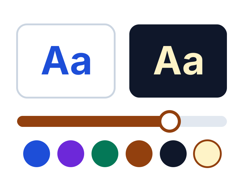
Test your colours with the contrast checker
Enter a text colour and a background colour. The checker calculates the contrast ratio and shows for each WCAG requirement whether your colours pass.
Your colours
Result
This is normal text in your colours.
Large text
Contrast ratio:
- Normal text, level AA (4.5:1)Passed
- Large text, level AA (3:1)Passed
- Controls, level AA (3:1)Passed
- Normal text, level AAA (7:1)Failed
- Large text, level AAA (4.5:1)Passed
Why colour contrast matters
Visitors with low vision, colour blindness or ageing eyes find text with low contrast hard or impossible to read. People reading on a phone outdoors or on a basic screen also benefit from good contrast.
Good contrast makes your buttons, prices and headings stand out and your text faster to read. That way you reach more customers with the same pages.
The contrast requirements of WCAG 2.2
For level AA, the usual target, 1.4.1, 1.4.3 and 1.4.11 apply. The enhanced contrast of 1.4.6 belongs to level AAA.
| Success criterion | Level | What it requires |
|---|---|---|
| Use of Color (1.4.1) | A | Colour is never the only way to convey information, such as an error message or a link in running text. |
| Contrast (Minimum) (1.4.3) | AA | Normal text has a contrast of at least 4.5:1 with its background, large text at least 3:1. |
| Non-text Contrast (1.4.11) | AA | Parts you need to operate the page, such as input borders, focus outlines and icons, and informative graphics have a contrast of at least 3:1 with their surroundings. |
| Contrast (Enhanced) (1.4.6) | AAA | Normal text has a contrast of at least 7:1, large text at least 4.5:1. |
What counts as large text?
Large text is at least 18 point, about 24 pixels, or at least 14 point bold, about 18.5 pixels. Large text has the lower requirement of 3:1, because larger letters stay readable with less contrast.
The displayed size counts. If a heading is shown smaller on a phone, the requirement for normal text may apply there.
Exceptions to the contrast requirement
This text has no contrast requirement:
- Text in logos and brand names.
- Text in disabled controls, such as a button that cannot be used yet.
- Purely decorative text and text that is not visible to anyone.
- Text that is part of a photo with a lot of other visual content, such as a street sign in a photo.
How the contrast ratio is calculated
The contrast ratio compares how light the lighter and the darker colour are. The result lies between 1:1, for two equal colours, and 21:1, for black on white. The higher the ratio, the easier to read.
The calculation accounts for how the eye sees colours: green looks much lighter to the eye than blue. Do not round the result, because 4.49:1 does not meet the 4.5:1 requirement.
Better contrast within your own brand
Use a dark shade for text
Use your brand colour for surfaces and accents, and a darker shade of the same colour for text and links.
Tip: Try darker and darker shades of your brand colour in the contrast checker above until you reach 4.5:1.
Give text on photos a solid background
Text over a photo has varying contrast. Put a solid or semi-transparent surface behind it, or place the text next to the image.
Check every state
Also check how buttons and fields look when you move the mouse over them, when they are selected or show an error, and check the example text in input fields.
Record your colour pairs
Note in your brand guidelines which text and background colours pass together. Then everyone in your team picks a good combination from now on.
Monitor contrast every week
New content, campaign banners and theme updates change your colours without you noticing. AccessRadar's automated tests check the contrast of your text in every weekly scan. That way you spot new contrast problems in time, with the page where they occur.
Automatic tests and AI content analysis
AccessRadar combines automatic tests with AI content analysis. You see not only technical errors, but also which texts truly help your visitors.
The AI analysis reads the text of your pages and gives suggestions, for example for:
- Alternative text: does the text say something meaningful, or is it 'image', a file name or 'click here'?
- Link text: do the link text and the text around it make clear where a link leads?
- Headings and labels: do they describe the topic or the field, or are they empty words such as 'Info' or 'Field 1'?
- Page titles and forms: is it clear what a page is about and what a field expects?
You get concrete suggestions for better texts, which you pick up directly in your weekly improvement plan. This way your website moves closer to WCAG 2.2 AA suitability every week and reaches more customers.
Read how tests and AI analysis work together in the improvement plan
Read also
Practical explanations of WCAG and digital accessibility.
WCAG 2.2 AA Checklist: What Should You Check on Your Website?
A practical WCAG 2.2 AA checklist per category, with explanations and tips to improve right away. Useful for owners, editors and developers.
Writing Alt Text: How to Make Images Accessible
How do you write good alt text? Read when an image needs it, with examples for product photos, buttons, logos and charts.
Keyboard Accessibility: Make Your Website Work Without a Mouse
Does your website work without a mouse? Read which WCAG requirements apply to keyboard operation and focus, how to test yourself and how to fix common problems.
Check your website for WCAG for free
Request the free WCAG check from AccessRadar and receive the results of an automatic scan by email, as a starting point for your improvements.
Want to keep going every week afterwards? The WCAG improvement plan adds weekly scans and AI content analysis.
A WCAG scan supports your assessment. An automated WCAG scan cannot establish full WCAG 2.2 AA compliance. Combine regular WCAG scans with manual evaluation and feedback from people with disabilities.
Frequently Asked Questions About Colour Contrast
What colour contrast does WCAG require?
At level AA, the usual target, normal text needs a contrast of at least 4.5:1 and large text at least 3:1. Icons, input borders and other controls need at least 3:1.
Does the contrast requirement apply to buttons?
Yes. The text on a button reaches 4.5:1 against the button colour. If you recognise the button only by its shape or border, that border needs a contrast of at least 3:1 with the background.
Does the contrast requirement apply to logos?
No. Text that is part of a logo or brand name has no contrast requirement.
Does example text in an input field count?
Yes. Example text in an input field (a placeholder) is text and needs a contrast of 4.5:1. Always add a visible label as well, because the example text disappears as soon as someone types.
How do I test the colour contrast of my whole website?
Use the contrast checker on this page for individual colour pairs. For your whole website, automated tests check the contrast of the text on your pages, as in AccessRadar's free WCAG check.